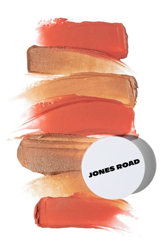
Many businesses invest heavily in professional product photography but ignore how important typography is in shaping the brand’s perception. Typography isn’t just about choosing fonts; it’s a visual tool that conveys tone, personality, and consistency. Therefore, when it is neglected, even the best visuals fail to create a strong brand impact. That’s where brands need to realise that combining strong typography with product photography can help them to elevate their identity. In this blog, we’ll explore exactly how typography and photography work together in branding, along with some tips to avoid mistakes, so you can understand how to make use of both elements in your branding efforts.
The Role of Typography in Branding
Communicating Brand Personality
Typography instantly conveys your brand’s character. A sleek sans-serif font might reflect modern innovation, while a classic serif font suggests tradition and reliability. The use of Script fonts, on the other hand, often communicates creativity or luxury. This personality consistency helps consumers identify your brand before they even read the content.
Building Recognition and Trust
When your brand uses the same style of typography on all its packaging, ads, and online materials, people start to recognize it instantly. This consistency makes your brand look organized and dependable. Over time, customers become familiar with how your brand looks and feel more confident buying from you.
Establishing Hierarchy and Readability
Typography also helps to guide the viewer’s eye by showing what to look at first, like the brand name, then leading them to the other details. This makes sure important things are easy to notice and don’t get lost in the design.
Typography also guides the viewer’s eye, setting a visual hierarchy that shows what’s most important first, like the brand name, followed by supporting text. A clear hierarchy makes sure that important details like product name, benefits, or the call to action aren’t lost in the visuals.
Tips for Aligning Typography with Product Photography
Typography and photography must complement each other; when executed thoughtfully, they can turn a simple image into a powerful brand statement.
Match the Typography to the Product Aesthetic
The typography should reflect the tone of your product imagery.
- Modern products like tech gadgets pair best with clean, minimalist sans-serif fonts.
- Artisan- or handcrafted-goods benefit from warm, humanist serif or script fonts.
- Luxury products often use refined serif or high-contrast fonts that mirror elegance.
Maintain Clear Visual Hierarchy
Remember, your typography should complement, and not compete with, the product image. The brand name should be instantly readable, while secondary information can be subtler. Use hierarchy to guide the viewer’s eye, for example, a bolder font should highlight what matters most, such as the product name or a key benefit, while smaller text can include additional information like size or features.
Use Consistent Font Pairings
Establish a defined typographic palette: one primary typeface for brand names or headlines, and one complementary typeface for descriptions or taglines. Always keep this consistent across product videos, photography, packaging, and online platforms. This uniformity strengthens recognition and conveys your professionalism.
Integrate Typography Into the Composition
During the photoshoot or design stage, plan where your typography will appear. Leaving negative space in the image ensures that the text fits naturally without covering your product. For example, an open background or an area with softer focus creates a perfect visual balance between text and subject. Merging typography with photography at this stage ensures both elements work together for a clean look.
Test Across Different Formats
Your typography and imagery may look perfect on the large poster, but they can lose impact on smaller screens. Always test your designs on mobile devices, social media feeds, and packaging mockups. This ensures that the combination remains legible and effective in every format.
Common Mistakes to Avoid When Adding Typography in Visual Branding
Here are common pitfalls to avoid when blending typography with product photography:
Mismatched Typography and Imagery
Don’t use typography that doesn’t align with the tone or mood of your product photography, as it can confuse viewers. For instance, using a playful handwritten font with a sleek tech product or a rigid geometric font for an organic skincare line sends mixed signals.
Overcrowding the Image with Text
If you add too many words or large blocks of text, it will hide the product and make no sense at all to the viewer. Keep in mind that photography should remain the hero. When text dominates the frame, it disrupts visuality and distracts from the product’s details, colors, and texture, all of which help in selling the item.
Ignoring Scale and Context
Sometimes a typographic layout looks great in one setting but fails in another. For example, what reads well on packaging might not work for digital ads. So, avoid it by constantly adjusting text size, spacing, and placement for different display contexts.
Ignoring Brand Emotion and Tone
If you choose fonts based only on looks, without considering how they make people feel, you can weaken your brand message. For example, for your luxury perfume brand, using a rigid industrial font may come across as cold. Make sure that your typography matches the emotional tone of your brand and supports the story your product photography is telling.
Conclusion
Typography gives your brand voice and personality, and product photography gives your brand visual presence. Together, when aligned, they create a cohesive brand story that draws attention and maintains recognition. If your brand is ready to strengthen its visual identity with professional, high-quality product photography, Elena Vels Studio can help you bring that vision to life. With clean styling, commercial versatility, and a proven track record across industries, we are the trusted choice for e-commerce and commercial brands. Let us change your brand visuals into a market-winning identity.


